Which Oil and Gas KPIs Actually Move the Needle?

Track five to seven KPIs across production, asset utilization, safety, financials, and environmental performance, then automate the data feeds behind them. That’s the whole strategy in one sentence. Everything else is execution detail.
The categories that matter most:
- Production: rate, decline curve, uptime
- Asset utilization: Overall Equipment Effectiveness (OEE), downtime hours
- Safety: process safety events, tracked across four tiers
- Financial: cost per barrel of oil equivalent (boe), Reserve Replacement Ratio
- Environmental: emissions intensity, compliance rate
- Maintenance: mean time to repair, backlog volume
Pro Tip: Don’t chase 20 metrics because a dashboard vendor can display them. IOGP Report 456 and the trade press covering it both point toward a smaller set of well-defined, tiered indicators over a sprawling scorecard nobody reads twice.
Process safety KPIs should follow the four tier framework from IOGP and align with API RP 754, which most operators already reference for defining what actually counts as a loss of containment event. Pull benchmark ranges from a source like KPI Depot before you set targets, so you’re not guessing at what “good” looks like for your asset class.
TL;DR:
- Focus on five to seven core KPIs that directly influence operational decisions, such as cost per boe, TRIR, and uptime, rather than tracking numerous metrics.
- Ensure safety metrics follow the four-tier framework from IOGP and API RP 754, with lagging indicators for Tier 1 and 2 events and leading indicators for Tier 3 and 4.
- Standardize calculation definitions across teams before building dashboards to prevent credibility issues caused by inconsistent data.
- Assign an accountable owner to each KPI to maintain focus, drive operational changes, and prevent metrics from becoming meaningless charts.
- Automate primary data collection at the source to prevent stale, inaccurate reports, and review targets quarterly to adapt to market shifts.
Table of Contents
- What Are the Core Oil and Gas KPIs by Category?
- Why Does the Four Tier Safety Framework Matter?
- How Do You Calculate the Core Oil and Gas Performance Metrics?
- How Should You Choose and Prioritize Your KPIs?
- How Do You Build a KPI Dashboard That Doesn’t Lie to You?
- Why Do KPI Programs Fail in the Field?
- What Do Real KPI Rollouts Get Right and Wrong?
- Key Takeaways
- What This Guide Gets Right That Most KPI Advice Misses
- Sources
- FAQ
What Are the Core Oil and Gas KPIs by Category?
Every KPI belongs to a category, and every category answers a different question about your operation. Mixing them up is how dashboards turn into wallpaper.
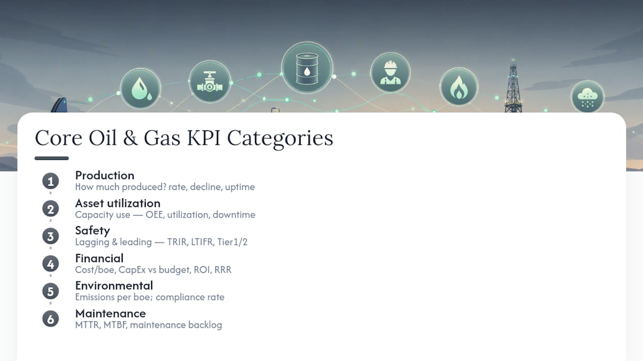
Production KPIs tell you how much you’re pulling out of the ground and whether that volume is holding steady. The standard set includes production rate (measured in barrels per day or thousand standard cubic feet per day for gas), decline rate (the percentage drop in output over time as a reservoir depletes), and uptime (the share of scheduled time a well actually produces).
Asset utilization KPIs measure how hard your equipment works relative to its theoretical capacity. OEE combines availability, performance, and quality into one number and is borrowed from manufacturing but fits upstream operations well. Utilization rate and downtime hours round out this category, and both depend on accurate field logging rather than end-of-month estimates.
Safety KPIs split into lagging and leading indicators. Total Recordable Incident Rate (TRIR) and Lost Time Incident Frequency Rate (LTIFR) are the lagging, injury-based measures. Process safety events, tracked at Tier 1 and Tier 2 under the IOGP framework, capture actual losses of containment rather than personal injuries, which is a distinction a lot of safety programs still blur.
Financial KPIs answer the money question directly: cost per boe, capital expenditure versus budget, return on investment, and Reserve Replacement Ratio, which the Energy Information Administration defines as reserves added divided by production volume for the period.
Environmental KPIs cover emissions intensity (typically expressed per boe produced) and environmental compliance rate, tracking permit adherence and reportable incidents.
Maintenance KPIs close the loop: mean time to repair (MTTR), mean time between failures (MTBF), and maintenance backlog, usually expressed as open work orders or hours of deferred work.
Why Does the Four Tier Safety Framework Matter?
Process safety is where most oil and gas KPI programs get sloppy, mostly because injury rates and containment failures get lumped together when they measure completely different things. The IOGP Report 456 framework, aligned with API RP 754, fixes that by splitting indicators into four tiers.
- Tier 1 captures the most severe loss of primary containment (LOPC) events, those with major consequences like fire, explosion, or significant release.
- Tier 2 covers less severe LOPC events that still represent a containment failure but with a smaller consequence footprint.
- Tier 3 tracks barrier performance indicators, challenges to safety systems that didn’t result in a Tier 1 or 2 event but show a barrier under stress.
- Tier 4 monitors management system conformance, things like inspection completion rates and competency assurance that indicate whether your safety systems are actually being executed as designed.
Tiers 1 and 2 are lagging by nature. You only find out about them after containment has already failed. Tiers 3 and 4 are leading indicators, and that’s where the real diagnostic value sits.
Leading indicators exist to catch a weakening barrier before it becomes an incident report. A facility with zero Tier 1 events but a rising trend in Tier 3 challenges is not actually safe. It’s lucky, and luck runs out.
The hard part isn’t picking targets. It’s making sure your team defines “loss of primary containment” the same way IOGP does, because internal definitions that drift from the standard quietly break every benchmark comparison you try to make later.
How Do You Calculate the Core Oil and Gas Performance Metrics?
Formulas are where KPI programs either become useful or become decoration. Here’s how to run the numbers on the ones that matter most.
TRIR = (Number of recordable incidents × 200,000) ÷ Total hours worked. The 200,000 constant represents 100 employees working 40 hours a week, 50 weeks a year, so the result is comparable across companies of different sizes. If your crew logs 500,000 hours in a year with 3 recordable incidents, your TRIR is (3 × 200,000) ÷ 500,000 = 1.2.
LTIFR = (Number of lost time injuries × 1,000,000) ÷ Total hours worked. This one uses a million-hour base rather than 200,000. Two lost time injuries across 2,000,000 hours worked gives you an LTIFR of 1.0.
Reserve Replacement Ratio = Reserves added during the period ÷ Production during the period. The related Reserves-to-Production (R/P) ratio divides total remaining proved reserves by annual production, giving you a rough years-of-life estimate for the asset, both terms defined in EIA’s performance profile standards.
Cost per boe = Total operating expense ÷ Total production in boe for the period. Straightforward, but only as reliable as your expense allocation across wells.
OEE = Availability × Performance × Quality, each expressed as a percentage. A well running at 90% availability, 95% performance, and 99% quality rate land at an OEE of roughly 84.6%, which is a useful single number for spotting equipment that’s quietly dragging down output.
Report safety tier metrics and production KPIs monthly at minimum, financial ratios like Reserve Replacement Ratio annually or quarterly, and maintenance metrics like MTTR on a rolling basis as work orders close.
How Should You Choose and Prioritize Your KPIs?
Picking KPIs isn’t a brainstorming exercise. It’s a filtering exercise, and most teams skip the filtering.
- Tie every KPI to one operational lever. If a metric doesn’t map to a decision someone can actually make, cut it. Cost per boe maps to procurement and staffing decisions. A vanity metric like “total wells monitored” doesn’t map to anything.
- Assign a single accountable owner per KPI. Bain’s analysis of operational excellence in oil and gas found that misalignment between targets and individual accountabilities is a leading cause of KPI programs stalling out. A KPI with no owner is a chart, not a management tool.
- Set target bands using benchmark data, not internal guesswork. Databases like KPI Depot publish comparative ranges across segments so you know whether your TRIR or cost per boe is actually competitive.
- Review targets quarterly. Commodity price swings and decline curves shift fast enough that annual-only reviews leave you managing against stale numbers.
- Build a single source of truth for every KPI’s underlying data, so field, finance, and safety teams pull from one dataset instead of reconciling three spreadsheets before a meeting.
Pro Tip: Limit your starting metric set to five to seven KPIs. Programs that launch with fifteen or twenty almost always collapse under their own reporting burden within two quarters.
Once targets are set, link the thresholds to automated alerts that generate work orders directly, whether that’s a maintenance ticket when MTBF drops below a set point or a compliance flag when a permit renewal nears its deadline.
How Do You Build a KPI Dashboard That Doesn’t Lie to You?
Reliable dashboards come from two phases, not one. Documented digital transformation projects in the sector that followed this sequence saw data consistency improve to roughly 92% and reporting cycles shorten by about 38%.
- Phase 1: standardize. Define exactly what counts as “downtime,” what hours feed into TRIR, and where each number originates, before you build a single chart.
- Phase 2: build the dashboard. Layer visualization and alerting on top of the standardized data, not before it.
- Architecture that works: field capture → standardized data pipeline → KPI calculation engine → dashboard with automated alerts.
Platforms built specifically for upstream operators, like Wellsmanager, handle this by pairing a mobile field log with per-well profit-and-loss statements and compliance alerts, so the same entry that logs a repair cost also feeds your maintenance and financial KPIs without a second data entry step.
Why Do KPI Programs Fail in the Field?
Data lag is the most common failure point. A well site logging maintenance activity on paper, then transcribing it into a spreadsheet days later, guarantees your MTTR and downtime numbers are stale before anyone reads them. Automation of primary data capture at the point of entry closes that gap, but only if field staff actually adopt the tool instead of working around it.
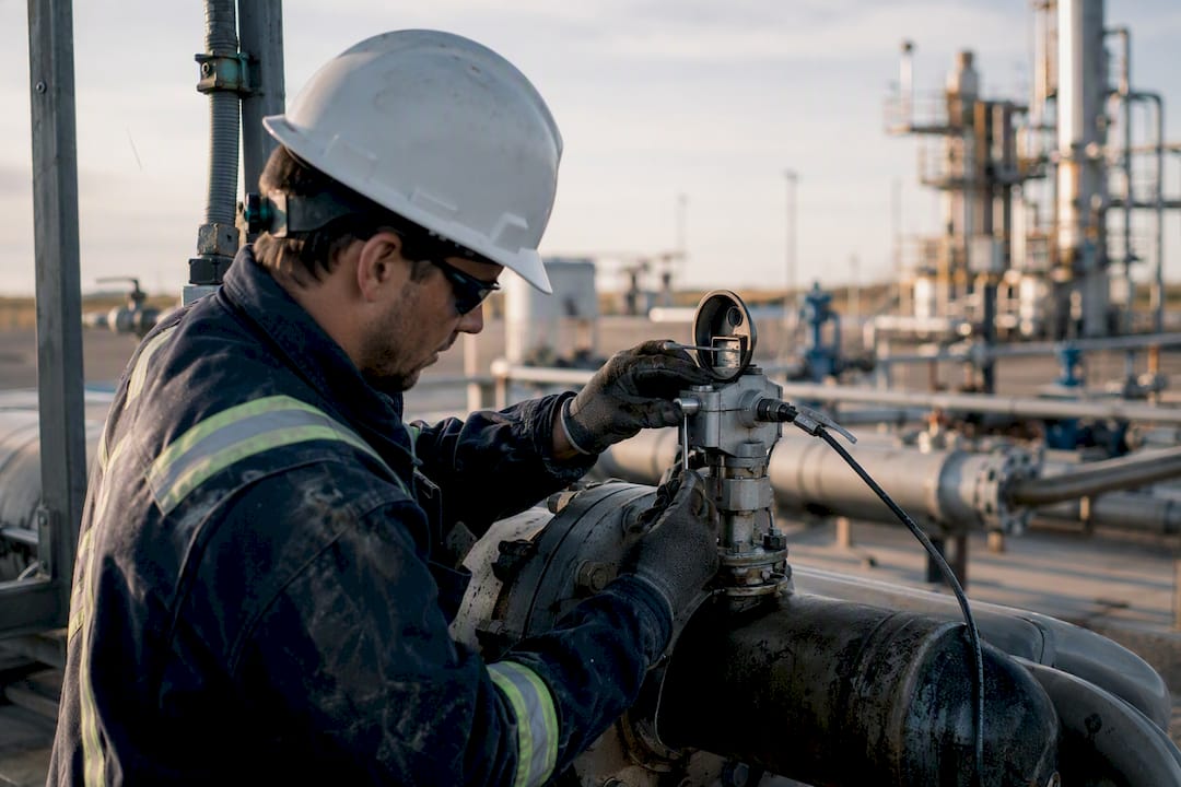
Sensor inaccuracy is the second problem, and it’s sneakier because bad sensor data looks like real data until someone cross-checks it. A flow meter drifting out of calibration can quietly inflate or deflate production KPIs for months before anyone notices the trend doesn’t match reconciled sales volumes.
Cultural resistance is the third, and it’s the one technology can’t fix on its own. Field crews who’ve watched three dashboard initiatives come and go tend to treat a fourth one as busywork, especially if past programs demanded extra reporting without removing any of the manual work it was supposed to replace. The fix isn’t more training decks. It’s making the KPI tool the fastest way to log something, not an extra step layered on top of the old way.
Definition drift compounds all three. When one region counts “downtime” differently than another, inconsistent calculation definitions quietly break every benchmark comparison you try to run across assets, even when every individual number looks reasonable in isolation.
What Do Real KPI Rollouts Get Right and Wrong?
The clearest documented success pattern comes from digital transformation projects in heavy oil operations that sequenced their work correctly: standardize the data model first, then build the dashboard. That two-phase approach produced measurable gains in data consistency and reporting speed, and the sequencing mattered more than the visualization tools chosen afterward.
The common failure pattern looks almost the opposite. A team builds an impressive dashboard first, discovers three months in that finance and field operations have been calculating “cost per boe” differently the entire time, and spends the next quarter rebuilding trust in numbers that already shipped to investors. Bain’s research on the sector points to a related failure mode: KPIs get set at the corporate level with no individual accountable for moving them, so the metric sits on a screen and nothing changes operationally, regardless of how the trend line moves.
The pattern that separates the two outcomes isn’t sophistication. It’s sequence and ownership. Teams that nail down definitions and assign an owner before building visuals tend to end up with numbers people trust. Teams that reverse the order end up debugging their dashboard’s credibility instead of debugging their operations.
Key Takeaways
A working oil and gas KPI program depends on picking five to seven metrics tied to real operational levers, aligning safety indicators to the IOGP four-tier framework, and automating data capture so numbers stay current.
| Point | Details |
|---|---|
| Limit your metric count | Track five to seven KPIs tied to specific operational decisions, not everything a dashboard can display. |
| Split lagging from leading safety metrics | Use Tier 1 and 2 for containment failures, Tier 3 and 4 to catch weakening barriers before an incident. |
| Standardize before you visualize | Define calculation rules for every KPI first; dashboards built on inconsistent definitions erode trust fast. |
| Assign one owner per KPI | Metrics without an accountable owner rarely drive behavior change, regardless of how they trend. |
| Automate field data capture | Manual, delayed entry is the single biggest cause of stale or inaccurate KPI reporting. |
What This Guide Gets Right That Most KPI Advice Misses
Most KPI content treats safety, financial, and operational metrics as one undifferentiated pile, and that’s the core mistake. Process safety KPIs behave nothing like financial KPIs. One measures containment integrity through barrier health, the other measures capital discipline, and blending them into one dashboard section is how leading indicators get buried under lagging noise.

The conventional advice to “track more metrics for better visibility” is backward for most independent operators. More metrics without an accountable owner and a standardized definition just produce more numbers nobody trusts. The teams that get real value start narrow, five to seven KPIs, and expand only after the data pipeline behind those metrics is solid.
If you take one thing from this: fix your definitions before you fix your dashboard. A gorgeous chart built on inconsistent field data is worse than no chart at all, because it creates false confidence. Get the field-to-finance data flow right first. The visualization is the easy part.
— Pedro
Sources
- Performance profiles style sheet | U.S. Energy Information Administration
- 12 Most Important Oil & Gas KPIs to Track (2026) | KPI Depot
FAQ
What Are the Five Main Oil and Gas KPIs?
The five most commonly tracked categories are production rate, asset utilization (OEE), safety (TRIR and process safety events), cost per boe, and Reserve Replacement Ratio.
What Are Five Key Performance Indicator Examples in This Industry?
TRIR, LTIFR, Reserve Replacement Ratio, cost per boe, and OEE cover safety, reserves, cost, and equipment performance in a single set.
What Are the Top Three KPIs for an Independent Operator?
Cost per boe, TRIR, and uptime typically carry the most weight for independent operators because they directly reflect cost control, safety exposure, and revenue generation.
How Do Manufacturing-Style KPIs Like OEE Apply to Oil and Gas?
OEE, calculated as availability multiplied by performance and quality, transfers well from manufacturing because upstream equipment faces the same downtime, speed loss, and output-quality questions as a production line.
How Often Should Process Safety KPIs Be Reported?
Tier 1 and 2 events should be reported as they occur, while Tier 3 and 4 leading indicators are typically reviewed monthly to catch trends before they become incidents.