Asset Utilization Analysis for Operations and Finance
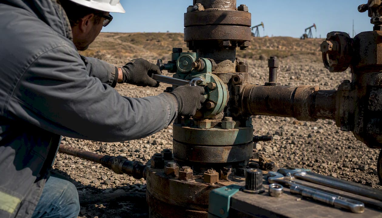
Asset utilization analysis measures how effectively your organization converts asset capacity into output or revenue. Two formulas do most of the work: Utilization rate = (Actual output / Potential output) × 100, which tells you what share of available capacity you’re actually using, and Asset turnover = Revenue / Average total assets, which tells you how many dollars of revenue each dollar of assets generates.
Your immediate next step: pull actual run-hours (or output units) for your three highest-value assets over the last 30 days, pull their theoretical maximum from your CMMS or ERP, and compute the utilization rate for each. That single data pull will surface your biggest gap faster than any dashboard.
- Utilization rate = (Actual output / Potential output) × 100
- Asset turnover = Revenue / Average total assets
- First action: 30-day run-hours vs. theoretical max for your top three assets
Table of Contents
- What does asset utilization analysis actually measure?
- Which KPIs should you track alongside utilization?
- How do you calculate utilization rate and asset turnover?
- Where does reliable utilization data come from?
- How do you turn utilization numbers into prioritized actions?
- What are the most effective strategies for raising utilization?
- How do you interpret utilization results and set benchmarks?
- A repeatable 4–8 week asset utilization audit plan
- Asset utilization analysis in upstream oil and gas
- What the most important actions and metrics are
- The gap between measuring utilization and actually doing something with it
- Wellsmanager gives upstream operators a faster path from data to decision
- Sources
What does asset utilization analysis actually measure?
The phrase covers two distinct concepts that practitioners often conflate, and mixing them creates real measurement errors.
Operational utilization is time- or output-based. You compare what an asset actually produced against what it could have produced under ideal conditions. This is the right lens for production equipment, drilling rigs, vehicles, and wells, where the question is: “How much of this machine’s capacity am I capturing?” Asset utilization measures how much an organization uses equipment compared to its potential, and improvement tactics typically involve increasing uptime, tightening scheduling, and reallocating underused assets.
Financial utilization is the asset turnover ratio: revenue divided by the book value of assets. It answers a different question entirely: “How hard are my assets working to generate revenue?” This ratio is most useful for capital-allocation decisions, comparing business units, or benchmarking against industry peers. As OpenLearn’s financial analysis guidance explains, the ratio expresses how many times sales cover capital employed, and it must always be read with industry context because asset-heavy sectors like oil and gas naturally carry lower ratios than asset-light businesses.
The asset types you’ll measure, and how you measure them, differ by class:
- Production equipment and machinery: time-based utilization (scheduled hours vs. run hours) or output-based (units produced vs. rated capacity)
- Wells and drilling assets: production volume vs. tested potential, plus downtime categorization (mechanical, regulatory, market curtailment)
- Fleet and vehicles: miles driven or hours operated vs. available hours; threshold-based programs flag assets below minimum use levels
- Buildings and facilities: square footage occupied vs. total leasable area, or throughput vs. designed capacity
- Tools and support equipment: check-out frequency vs. available inventory
The business stakes are direct. Low operational utilization means you’re paying for capacity you’re not using, which inflates your cost per unit. Low asset turnover signals that capital is tied up in assets that aren’t generating proportional revenue, which affects capex decisions and working capital.
Which KPIs should you track alongside utilization?
Utilization alone is a dangerous single number. The metrics below give utilization its context.
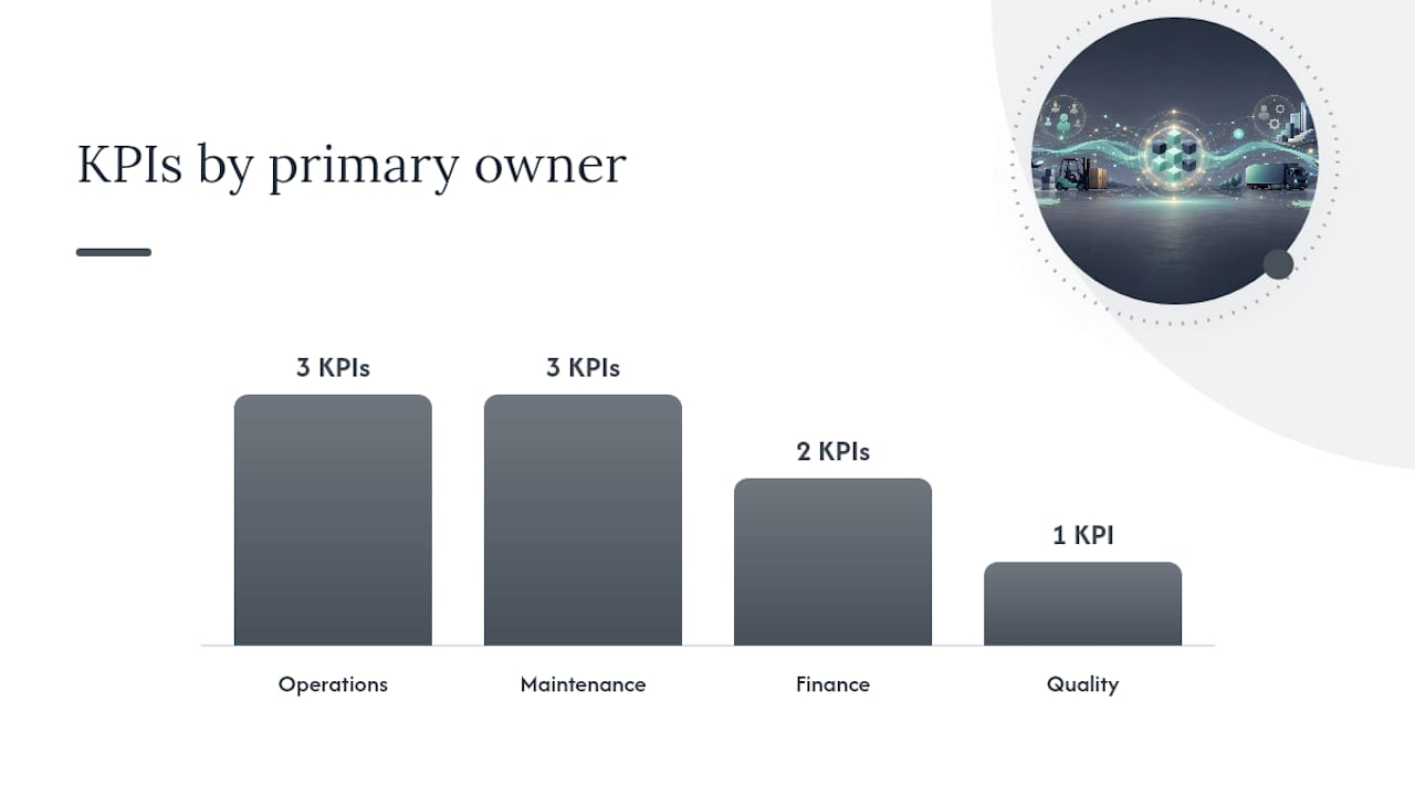
| Metric | Formula | Primary owner | Best used for |
|---|---|---|---|
| Utilization rate | (Actual output / Potential output) × 100 | Operations | Capacity planning, scheduling |
| Asset turnover | Revenue / Average total assets | Finance / FP&A | Capital allocation, benchmarking |
| Availability | (Total time – Downtime) / Total time × 100 | Maintenance | Reliability tracking |
| Performance rate | (Actual output / Theoretical output during run time) × 100 | Operations | Speed loss diagnosis |
| Quality rate | Good units / Total units produced × 100 | Quality / Ops | Defect and rework tracking |
| OEE | Availability × Performance × Quality | Operations / CI | Overall manufacturing efficiency |
| MTBF | Total run time / Number of failures | Maintenance | Failure frequency |
| MTTR | Total repair time / Number of repairs | Maintenance | Repair efficiency |
| Asset ROI | (Net income from asset / Asset cost) × 100 | Finance | Investment justification |
OEE vs. utilization is the most common point of confusion. Utilization measures the achieved share of potential output; OEE bundles availability, performance, and quality into a single manufacturing-efficiency metric. Use utilization to answer “Are we running enough?” and OEE to answer “When we run, how well are we running?”
KPI ownership matters. Operations typically owns availability, performance, MTBF, and MTTR because those metrics drive maintenance and scheduling decisions. Finance owns asset turnover and asset ROI because those feed the balance sheet and capital budget. OEE tends to sit at the intersection, which is exactly why it often falls into a reporting gap when ops and finance don’t share a common data layer.
Reporting cadence should match the decision cycle: daily or weekly for operational metrics (availability, MTBF), monthly for utilization rate and OEE, and quarterly for asset turnover and ROI. A mismatch between cadence and decision cycle is one of the most common reasons utilization data gets ignored.
Pro Tip: Never compare a capacity-based utilization rate directly to an asset turnover ratio in the same sentence without an explicit bridge. One is a percentage of physical capacity; the other is a revenue multiple. Mixing them in a single KPI dashboard without labels is how teams end up arguing about numbers that are measuring completely different things.
How do you calculate utilization rate and asset turnover?
Core formulas
Time-based utilization rate: Utilization (%) = (Actual run hours / Available hours) × 100
Output-based (capacity utilization): Capacity utilization (%) = (Actual throughput / Maximum rated throughput) × 100
Scheduled-availability-adjusted utilization: Adjusted utilization (%) = (Actual run hours / Scheduled available hours) × 100 (This version excludes planned shutdowns from the denominator, giving a cleaner view of unplanned loss.)
Asset turnover: Asset turnover = Revenue / Average total assets (Average total assets = (Beginning assets + Ending assets) / 2)
Explicit denominator choices matter: gross book value, net book value, installed capacity, and available capacity each produce a different number and lead to different managerial decisions. Decide before you measure, document the choice, and never change it mid-period without flagging the break.
Worked example 1: machine-hours on a production line
A stamping press has 2,080 scheduled hours in a year (52 weeks × 40 hours). Planned maintenance accounts for 80 hours. The press ran for 1,560 actual hours.
- Standard utilization: 1,560 / 2,080 × 100 = 75.0%
- Adjusted utilization (excluding planned maintenance): 1,560 / (2,080 – 80) × 100 = 1,560 / 2,000 × 100 = 78.0%
The 3-point difference tells you that planned maintenance is not the problem. The remaining 440 unplanned lost hours are where to focus.
Worked example 2: asset turnover from a financial statement
A mid-size manufacturer reports $18M in revenue. Total assets at the start of the year were $10M; at year-end they were $12M.
- Average total assets: ($10M + $12M) / 2 = $11M
- Asset turnover: $18M / $11M = 1.64x
That means every dollar of assets generated $1.64 in revenue. Whether that’s good depends on the industry, which the benchmarks section addresses.
Step-by-step calculation checklist
- Define scope: which assets, which time period, which denominator (gross vs. net book value, installed vs. available capacity).
- Pull raw data: run-hours or output units from CMMS/ERP; revenue and asset values from the general ledger.
- Clean the data: remove duplicate entries, reconcile timestamps, flag retired-but-on-books assets that inflate the denominator.
- Compute base metrics: utilization rate and asset turnover for each asset class.
- Segment: break results by asset class, site, shift, or product line before averaging.
- Validate: cross-check operational utilization against financial asset turnover to confirm they tell a consistent story.
Where does reliable utilization data come from?
The quality of your analysis is bounded by the quality of your data. Here’s how the common sources stack up:
- PLC/SCADA systems: high accuracy and low latency for run/stop states on automated equipment; limited to assets with installed automation; requires clean tag mapping to avoid double-counting.
- Sensors and telemetry (IoT): excellent for mobile assets, wells, and remote equipment; latency depends on connectivity; gaps in coverage create partial datasets that need reconciliation.
- CMMS (Computerized Maintenance Management Systems): the best source for planned vs. unplanned downtime categorization and work-order history; accuracy depends on technician discipline in logging.
- ERP and fixed-asset registers: authoritative for book values, depreciation schedules, and asset master data; often lags operational reality (retired assets still on books, new assets not yet registered).
- Manual logs: flexible and low-cost; high variability in accuracy and completeness; useful as a gap-filler or for assets too simple to instrument.
- RFID and telematics: strong for fleet and tool tracking; provides location and usage data; integration with financial systems is often a custom build.
A recurring problem: finance and operations teams frequently operate in silos, and only around 40–41% of leaders report being very satisfied with their ability to combine cross-functional data. The practical fix is a harmonized data taxonomy: agree on asset IDs, time-period definitions, and downtime categories before anyone pulls a report.
Data-quality checklist before you compute:
- Asset master is current: retired assets removed or flagged, new assets added with correct in-service dates.
- Timestamps are consistent: all sources use the same time zone and shift boundaries.
- Downtime is categorized: planned (scheduled maintenance, changeover) vs. unplanned (breakdown, no-demand).
- Depreciation method is documented: straight-line vs. accelerated affects net book value and therefore asset turnover.
- Instrumentation gaps are mapped: know which assets have no automated data and what the manual fallback is.
Reconcile the two datasets monthly. This gives you reliable numbers on the assets that drive most of your utilization variance without requiring a full sensor rollout.*
How do you turn utilization numbers into prioritized actions?
Raw utilization percentages don’t tell you what to fix. The analysis workflow below converts numbers into a ranked action list.
-
Segment by asset class and site. Aggregate utilization hides more than it reveals. A 72% fleet average might mask three vehicles at 95% and four at 40%. Break every metric down to the asset-class and site level before drawing conclusions.
-
Normalize for planned downtime. Strip out scheduled maintenance windows, planned changeovers, and regulatory shutdowns before comparing assets. An asset with heavy planned maintenance isn’t underperforming; it’s being managed. Comparing it unadjusted to a lightly maintained asset produces a false gap.
-
Run a Pareto of lost hours. Rank assets by total lost hours (or lost revenue equivalent) over the period. In most operations, 20% of assets account for 70–80% of total lost capacity. Focus there first. Translate lost hours into revenue impact: if a production line runs at $500/hour of throughput and lost 440 hours, that’s $220,000 in unrealized output.
-
Identify root causes. For each high-loss asset, correlate downtime events with maintenance logs, spare-parts lead times, and operator schedules. Common root causes cluster into three buckets: maintenance-driven (failures, slow repairs), scheduling-driven (idle time between jobs, shift gaps), and demand-driven (no orders, market curtailment).
-
Prioritize fixes by effort and impact. Quick wins are scheduling changes and operator training; they cost little and can show results in weeks. Structural fixes like process redesign or automation require capital and time. Build a 2×2 of impact vs. effort and work the high-impact/low-effort quadrant first.
-
Align cross-functional teams on findings. Integrated planning and shared data definitions materially improve decision-making and capital allocation. Present the Pareto and root-cause findings in a joint ops-finance review so that capital decisions are grounded in operational reality, not just financial ratios.
Diagnostic checklist:
- Downtime events cross-referenced with work-order history
- Spare-parts stockouts identified for top failure modes
- Operator schedule gaps mapped against idle-time events
- Demand-driven downtime separated from mechanical downtime
- Asset turnover ratio compared against operational utilization to check for financial/operational misalignment
Pro Tip: Resist the pull toward structural fixes before you’ve exhausted scheduling changes. Run that pilot for 60 days before approving any capex.
What are the most effective strategies for raising utilization?
Improvement tactics range from zero-cost scheduling adjustments to multi-year capital programs. Sequence them by payback speed.
-
Tighten scheduling and shift coverage. Idle time between jobs and shift-change gaps are the fastest utilization leaks to close. Map asset schedules against demand patterns and fill gaps before anything else.
-
Reduce changeover time. SMED (Single-Minute Exchange of Die) principles apply beyond stamping presses: any asset that requires setup between jobs benefits from standardized changeover procedures. Cutting changeover time by 30% on a high-utilization asset can recover meaningful run hours per week.
-
Implement preventive and predictive maintenance. Reactive maintenance creates unpredictable downtime spikes. A preventive schedule reduces unplanned failures; condition-based monitoring (vibration, temperature, pressure) lets you intervene before failure. The MTBF and MTTR metrics from your KPI dashboard tell you whether the program is working.
-
Optimize spare-parts inventory. Parts stockouts are a leading cause of extended MTTR. Analyze your top 10 failure modes, identify the critical spares, and set reorder points that match lead times. This is a working-capital trade-off, which is why ops-finance alignment matters here.
-
Train operators on asset care and early-fault detection. Operators who understand what normal looks and sounds like catch developing faults before they become failures. Autonomous maintenance programs (a pillar of TPM) consistently reduce unplanned downtime.
-
Redesign process flow and layout. When bottlenecks are structural, scheduling fixes have a ceiling. A layout change that eliminates a material-handling constraint or a process redesign that removes a non-value-added step can unlock capacity that no amount of scheduling optimization will reach.
-
Automate and reallocate. For assets that are genuinely underutilized and cannot be filled by demand, consider reallocation to higher-demand sites or disposal. A threshold-based utilization program treats assets below minimum thresholds as underutilized and requires justification or corrective action, including redirection or disposal within defined timeframes. That governance discipline works in manufacturing and fleet contexts alike.
Timeline and cost framework:
ROI estimation: for each tactic, estimate incremental throughput (recovered hours × throughput rate), reduced downtime cost (maintenance labor + parts + lost margin), and extended asset life (deferred replacement capex).
Pilot design criteria: run any new tactic on a single asset class or site for 60–90 days, measure the delta in utilization rate and downtime hours, and set a minimum improvement threshold (e.g., 5 percentage points) before scaling. This keeps capital risk low and builds the internal evidence base for larger investments.
How do you interpret utilization results and set benchmarks?
Benchmarks are useful guardrails, not targets. Context always wins.
Common interpretation pitfalls:
- Retired-but-on-books assets: an asset that’s been decommissioned but not removed from the fixed-asset register inflates the denominator in your asset turnover calculation and deflates the ratio artificially. Segmentation by asset class and period is essential to avoid misleading averages, and instrumentation gaps distort the ratio further.
- Seasonal demand: a utilization rate measured in Q4 for a seasonal business will look very different from Q2. Always normalize for seasonality before drawing year-over-year conclusions.
- Planned downtime counted as lost potential: if your denominator includes scheduled shutdown hours, your utilization rate will look lower than it actually is relative to your controllable capacity. Use the adjusted utilization formula from the calculation section.
- Over-optimizing utilization at the expense of reliability: pushing utilization above 90% on aging equipment often accelerates wear and increases failure rates. A high utilization number paired with rising MTTR and falling MTBF is a warning sign, not a success story.
Financial impact of a utilization gain: a 5–10 percentage point improvement in operational utilization on a constrained asset typically translates to a measurable revenue or cost-reduction impact. The exact figure depends on throughput rate, margin per unit, and whether the recovered capacity can be filled by demand. Run the calculation at the asset level, not the portfolio level, to get a number worth presenting to finance.
A repeatable 4–8 week asset utilization audit plan
This plan works for a single site or a focused asset class. Scale it up by adding parallel workstreams for additional sites.
-
Week 1: Scope and data mapping. Define which assets are in scope, confirm data sources (CMMS, ERP, telemetry), document the denominator choices (gross vs. net book value, installed vs. available capacity), and assign data owners. Output: a data map with source, owner, and known gaps.
-
Week 2: Data collection and cleansing. Pull raw run-hours, downtime logs, and financial asset data. Remove retired assets from the denominator, reconcile timestamps, and categorize downtime as planned vs. unplanned. Output: a cleaned dataset ready for analysis.
-
Week 3: Compute and segment. Calculate utilization rates and asset turnover for each asset class and site. Run the Pareto of lost hours. Flag assets below your minimum threshold for further investigation. Output: a KPI summary with segmented results.
-
Week 4: Root-cause diagnosis. For the top 20% of assets by lost hours, correlate downtime with maintenance logs, parts availability, and scheduling records. Identify the primary root cause for each. Output: a root-cause register with evidence.
-
Weeks 5–6: Hypothesis testing and pilot design. Develop one or two improvement hypotheses for the highest-impact assets. Design a 60-day pilot (scheduling change, maintenance intervention, or parts stocking adjustment). Define success metrics. Output: a pilot design document with baseline KPIs.
-
Weeks 7–8: Pilot launch and monitoring setup. Launch the pilot, configure the KPI dashboard, and establish a weekly review cadence with ops and finance stakeholders. Output: a live dashboard, a prioritized action list, and a pilot monitoring plan.
Deliverables checklist:
- Data map (sources, owners, gaps)
- Cleaned dataset with documented denominator choices
- KPI dashboard (utilization rate, asset turnover, availability, MTBF, MTTR)
- Pareto of lost hours with revenue impact
- Root-cause register
- Prioritized action list (quick wins vs. capex)
- Pilot design with success metrics
Success metrics to prove value: delta uptime (hours recovered per month), incremental throughput (units or revenue), reduction in unplanned downtime events, and payback period on any pilot investment. A well-run 8-week audit typically surfaces enough quick wins to fund the next phase of the program.
Asset utilization analysis in upstream oil and gas
Upstream oil and gas is one of the most asset-intensive environments you’ll find, and it’s also one where utilization analysis has historically been fragmented. Wells, compression equipment, saltwater disposal systems, and field vehicles each generate data in different formats, owned by different teams, reconciled (if at all) in spreadsheets.
Consider a realistic scenario: an independent operator running 40 producing wells. Each percentage point of uptime on those 8 wells represents a calculable volume of lost production. When you attach a realized price to that volume and compare it against the cost of a faster workover response, the capital case for a dedicated workover crew or a predictive maintenance program becomes straightforward. That’s the per-well P&L logic: utilization gains translate directly into revenue, and the analysis makes the number visible.

The challenge is data consolidation. Field logs, SCADA telemetry, CMMS work orders, and the general ledger rarely share a common asset ID or timestamp convention. Connecting finance and operations systems helps surface constraints early and improves capital allocation decisions, reducing the risk that operational choices undermine financial objectives. For upstream operators, that means a single source of truth that ties field-level telemetry to cost data and per-well revenue.
Implementation benefits when data is centralized:
- Root-cause analysis time drops from days to hours when downtime logs and work-order history are in the same system.
- Per-well ROI calculations become auditable: every cost and revenue line traces back to a specific well and time period.
- Capital decisions (workover approvals, equipment replacement) carry an audit trail that satisfies both internal governance and investor reporting requirements.
- Compliance notifications tied to asset status reduce the risk of regulatory exposure from unreported downtime events.
Pro Tip: In oil and gas, the most common denominator error is using gross book value for wells that have been partially impaired or are on artificial lift with significantly different cost profiles. Segment your well economics by lift type and impairment status before computing asset turnover. A single portfolio average will almost always mislead you.
Wellsmanager’s platform addresses this directly: per-well P&L tracking, field maintenance logging, and equipment downtime tracking are built into the same system, so the utilization analysis and the financial reporting draw from the same data layer rather than requiring a manual reconciliation step.
What the most important actions and metrics are
Effective asset utilization analysis requires the right formulas, clean data, and a cross-functional workflow that connects operational findings to financial decisions.
| Point | Details |
|---|---|
| Start with the right formula | Use utilization rate for operational capacity and asset turnover for financial benchmarking; never mix them without an explicit bridge. |
| Define your denominator first | Gross vs. net book value, installed vs. available capacity each produce different results; document the choice before measuring. |
| Pareto your lost hours | Rank assets by total lost hours and translate the top 20% into revenue impact before prioritizing any fix. |
| Align ops and finance early | Shared data definitions and integrated planning materially improve capital allocation decisions. |
| Wellsmanager for upstream operators | Per-well P&L, downtime tracking, and field logs in one platform eliminate the reconciliation step between operational and financial data. |
The gap between measuring utilization and actually doing something with it
Most organizations that struggle with asset utilization don’t have a measurement problem. They have an action problem. The formulas are not complicated. The data sources are known.
The conventional advice is to build a better dashboard. That’s not wrong, but it’s incomplete. A dashboard that shows utilization by asset class, updated weekly, is genuinely useful. What it doesn’t do is force the conversation between the maintenance manager who knows why the press keeps going down and the FP&A analyst who controls the spare-parts budget. Those two people are looking at different systems, using different asset IDs, and attending different weekly meetings. The KPMG data on cross-functional data satisfaction makes this concrete: fewer than half of leaders are very satisfied with their ability to combine ops and finance data. That’s not a technology gap; it’s a governance gap.
The fix is structural. Assign explicit KPI ownership: operations owns availability and MTBF; finance owns asset turnover and ROI; a joint owner (plant manager or VP of operations) owns the utilization rate that bridges them. Run a monthly joint review where both sides present from the same dataset. That single meeting, done consistently, closes more utilization gaps than any sensor upgrade.
The other thing the conventional advice underweights is the denominator. Practitioners spend enormous energy on the numerator (getting better run-hour data, improving telemetry coverage) and almost none on the denominator. But a fixed-asset register full of retired equipment, or a capacity figure that hasn’t been updated since the line was reconfigured two years ago, will make a genuinely well-run operation look mediocre. Clean your denominator before you trust your utilization number.
Wellsmanager gives upstream operators a faster path from data to decision
Upstream oil and gas operators face a version of the utilization problem that’s harder than most: data scattered across field logs, SCADA systems, and spreadsheets, with per-well economics that need to reconcile before anyone can make a capital decision. The analysis cycle that should take a week takes a month, and by the time the numbers are clean, the workover window has passed.
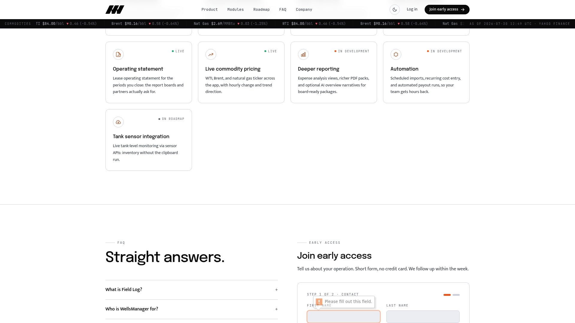
Wellsmanager is built specifically for this. Per-well P&L, field maintenance logs, vendor costs, and real-time compliance notifications all live in one platform, so your utilization analysis and your financial reporting draw from the same data layer. No reconciliation step. No version-control argument between the field team and the finance team. AI-generated executive briefs surface the findings automatically, and the audit trail supports every capital decision you take to investors or a board. If you’re running wells on spreadsheets and wondering why your utilization analysis takes longer than it should, request access to Wellsmanager and see what the same workflow looks like when the data is already connected.
Sources
- 5.4.1 Asset utilisation ratio | OpenLearn
- Asset Utilization Ratio - KPI Definition, Formula, & Benchmarks | KPI Depot
- Fleet Asset Utilization Analysis and Underutilized Assets
- Value of connection
- What is Asset Utilization? | ServiceChannel